Excalidraw: three steps to a drawing
Excalidraw has no sign-up screen to walk, because there is nothing to sign up for before you draw. We opened the address, picked a tool and dragged. The interesting part is not the speed — it is what the empty canvas teaches you on the way.
Entry point: excalidraw.com — the app is the home page — excalidraw.com
3 steps to the first useful action~1.0 s time to first valuefirst useful action: a shape on the canvas
The path we took
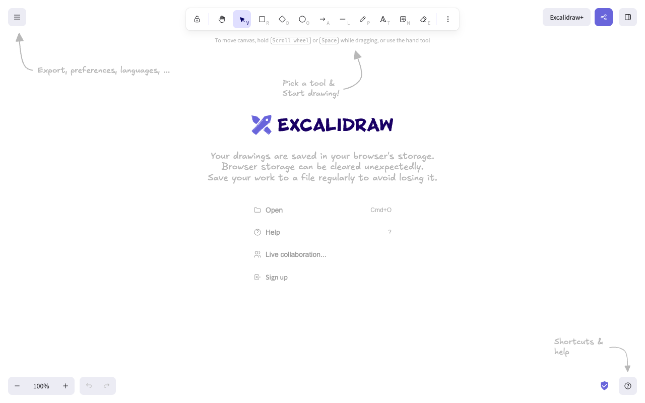
- Open excalidraw.com. The app itself answers — there is no marketing page in front of it, no cookie banner, no dialog, and nothing to accept.
- Click the rectangle tool in the toolbar (or press R — the shortcut is printed on the tool).
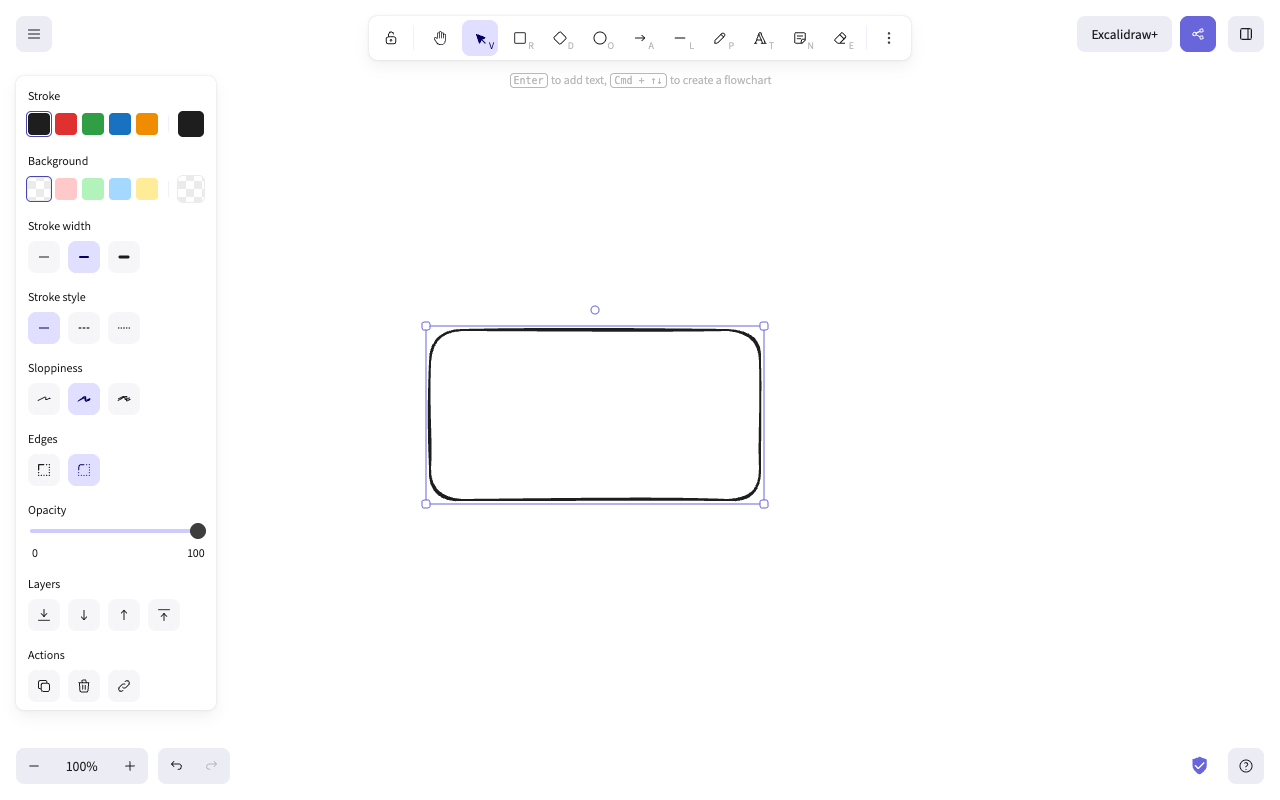
- Drag on the canvas. The rectangle appears under the cursor. That is the first useful action: there is now a drawing where there was not one.
What we measured
| Steps to the first useful action | 3 |
| Time to first value | about 1.0 s — the app was usable 0.98 s after the address was opened; picking the tool took 12 ms; the rectangle drew under the cursor, below our 16 ms measurement floor |
| Page load | first byte 0.10 s, DOMContentLoaded 0.63 s, load event 0.85 s |
| Weight on a cold cache | 0.9 MB over 18 requests |
| Things in the way | none — no cookie banner, no modal, no account gate, nothing to accept |
| Account asked for | never on the path; "Sign up" is the fourth item in a four-item list on the empty canvas |
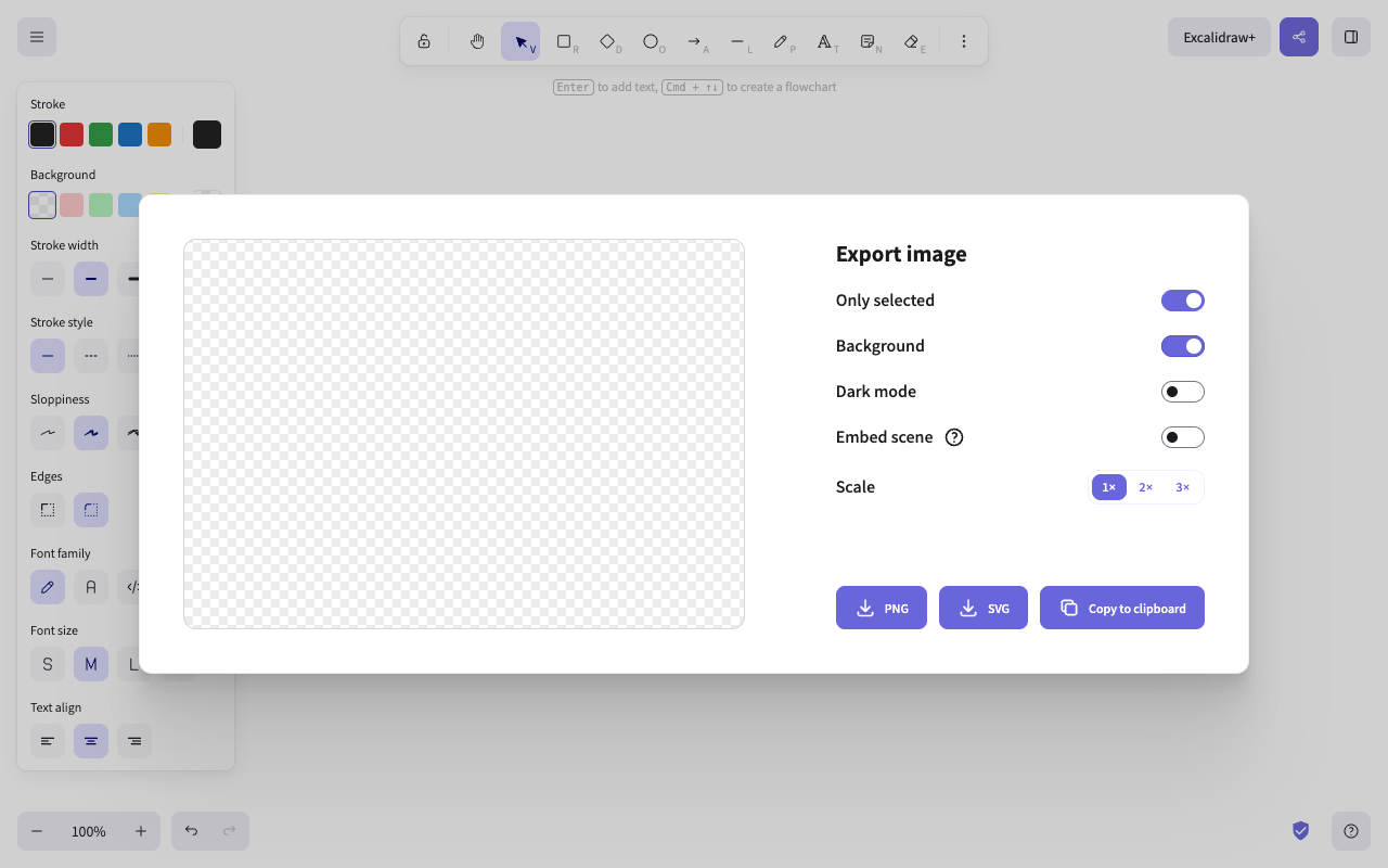
| Steps to get the drawing out | 2 more — menu → Export image → PNG, SVG or clipboard, still with no account |
The screens
What they do well
The product is the front door
There is no marketing page between the address and the canvas. The thing you came to do is the thing that loads. Products that put a landing page in front of the app pay for it twice: once in the extra click, and once in the doubt about whether the app is any good.
The empty state points instead of explaining
Two hand-drawn arrows aim at the toolbar and the menu, and the tools carry their keyboard shortcuts on their faces (R, D, O, A). Nothing has to be dismissed, and the second shape is faster than the first because you learned the shortcut while you were looking at the tool.
It teaches the next move at the moment the last one lands
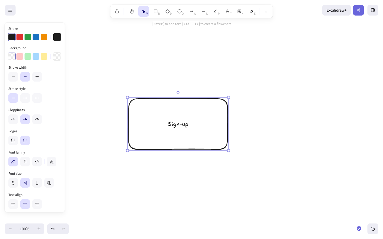
The instant the first rectangle exists, the hint bar changes to "Enter to add text, Cmd + ↑↓ to create a flowchart". That is the whole art of in-product guidance in one line: not a tour up front, but the right sentence at the moment it becomes true.
It tells you the uncomfortable truth early
The start screen says your drawings live in browser storage and that browser storage can be cleared unexpectedly. It says it before you have anything to lose, which is the only time that warning is a kindness rather than an excuse.
Three things we would change
Do not open the export dialog with an empty preview
Open the menu → Export image with nothing selected and the dialog appears with "Only selected" switched on and a blank checkerboard where your drawing should be. With the shape selected the preview is correct, so the toggle is doing exactly what it says — but the screen does not say it. Default the toggle off when the selection is empty, or print one line under the preview: "Nothing is selected — showing the whole canvas".
Why it matters. Export is the moment the work leaves the tool. An empty preview at that moment does not read as "a toggle is on"; it reads as "my drawing is gone". It is the one screen in the product where a wrong impression costs trust rather than time.
Give the storage warning something to press
The start screen warns that browser storage can be cleared unexpectedly and recommends saving to a file regularly. The four items next to it are Open, Help, Live collaboration and Sign up. Saving to a file is not one of them. Add "Save to file" to that list, and repeat the offer once — not on every visit — after a drawing grows past a handful of elements.
Why it matters. A warning without an action asks the reader to hold a to-do item in their head while they draw. The failure it predicts is total and silent: you do not find out that storage was cleared until you go back for the diagram.
Say what Excalidraw+ is where you show the button
The "Excalidraw+" button sits in the top-right corner, the place a first-time user looks for account and sharing, and the label alone says nothing about what it does. One line on hover or under the first-visit menu item — what it adds, in plain words — would make it an answer rather than an advertisement.
Why it matters. The first screen never says what changes if you sign up, so the only commercial element on it has to carry that sentence. A button that states its value is informative; the same button without it is the one piece of the screen a careful person learns to ignore.
What we could not see
We did not create an account, so we did not see the Excalidraw+ workspace, team files, permissions, or whatever onboarding runs behind a sign-up. Everything above is the public canvas at excalidraw.com and nothing else.
How we counted
- A step is one deliberate action that moves you along the path: a click or tap, one field filled in, one required choice, or one dismissal of something the product put in your way (a cookie wall, a modal, a tour). Activating the entry control — the button or address you start from — is step 1. Page loads, redirects and waiting are not steps.
- The clock starts when the entry control is activated and stops when the result of the first useful action is on screen. We measure the product’s own latency with the page’s own clock, never a stopwatch: every wait ends on a condition we poll for, and the reading excludes the time a person spends reading and deciding. Treat the number as a floor, not as a user’s experience.
- The first useful action is the first thing that produces the output you came for — a drawing on the canvas, an answer to a question you asked of your data, a workflow that ran. Finishing a tour, verifying an email or seeing a dashboard someone else built is not it.
- We never create accounts. Every walk uses a public demo, sandbox or test mode. When a product cannot be reached without signing up, we say so and walk something else. That means we see the front door, not the signed-in house, and we say what we missed.
Disclosure
Questions
Is three steps really the record?
It is the shortest path we have measured so far, and it is short because the product had to do nothing at all to achieve it — the app is the home page. The number to beat is not three; it is the number of decisions a person has to make before the tool does something for them, and here that number is one: which shape.
Does "about a second" mean anyone will see a second?
No. It is the product’s own latency on our machine and connection: first byte 0.10 s, load event 0.85 s, the app usable at 0.98 s. It excludes the time a person spends reading the screen and deciding what to press, which on a first visit is much larger than a second. We publish it because it is the part the product controls.
Why not walk the paid product?
We do not create accounts on other people’s products. The public canvas is the part of Excalidraw that everybody meets first, and it is the part that decides whether anyone ever reaches the paid one.
What would you copy into your own product?
The hint bar that changes the instant the first object exists. Most in-app guidance fires on arrival, when the user has no context for it; this one fires on the first success, when they do. We build that kind of prompt for a living and we still learned something from watching it here.