Plausible’s live demo: two steps to an answer
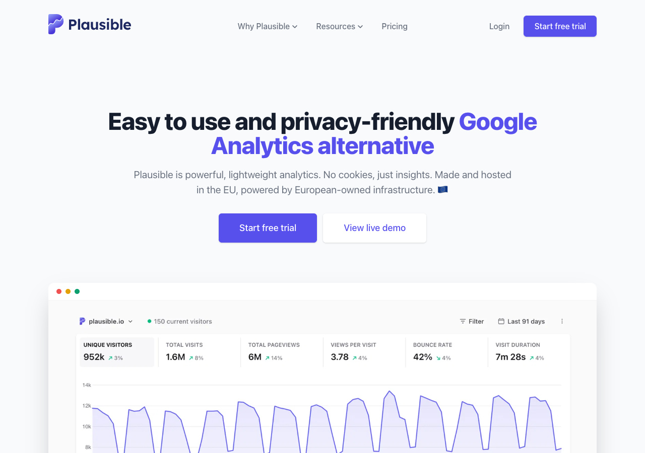
Plausible puts "View live demo" next to "Start free trial" in its hero, and the demo is the real product running on the company’s own traffic. Two clicks later the dashboard is answering a question we chose. The gap worth talking about is between the screen arriving and the numbers arriving.
Entry point: "View live demo" in the hero on plausible.io — plausible.io/plausible.io
2 steps to the first useful action~0.5 s to the screen, 2.4–3.3 s to the numbers time to first valuefirst useful action: the dashboard re-scoped to one traffic source
The path we took
- Click View live demo in the hero on plausible.io. It sits directly beside "Start free trial", the same size, with nothing asked in between — no email, no cookie dialog, nothing to accept.
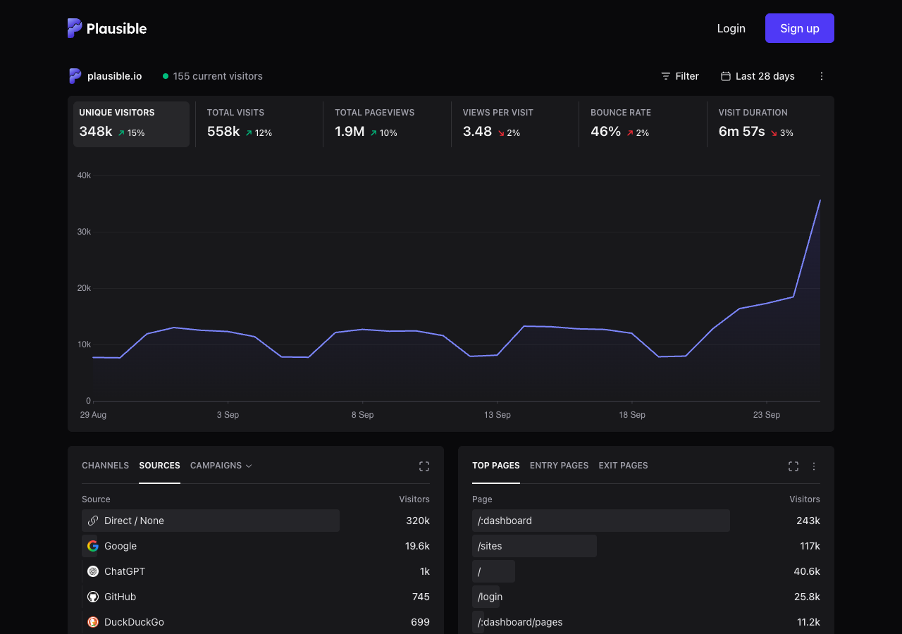
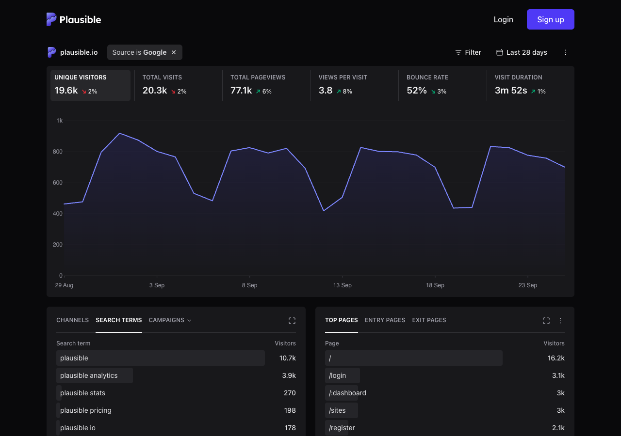
- On the demo dashboard, click a row in Sources (we clicked Google). The whole dashboard re-scopes to that source: the KPI tiles, the graph, the pages, the countries, the browsers. That is the first useful action — we asked the data a question of our own and it answered.
What we measured
| Steps to the first useful action | 2 |
| Time to first value | the dashboard was on screen in about half a second (first byte 0.16 s, load event 0.53 s); the numbers in it arrived over 9 API calls whose slowest took 2.4–3.2 s across three walks |
| Cost of the filter step | 8–9 more API calls, slowest 1.3–3.3 s; the layout never moved, only the numbers changed |
| Weight of the demo on a cold cache | 473 KB over 10 requests (the marketing page before it: 108 KB over 13) |
| Things in the way | none — no cookie dialog and no accept button on either page |
| Account asked for | never on the path; "Login" and "Sign up" sit in the top-right, and a "Start free trial" block waits at the very bottom of the page |
| Evidence the answer was real | unique visitors went from 348k to 19.6k and the top pages changed from /:dashboard and /sites to /, /login and /register |
The screens
What they do well
The demo is the product, on real data
The dashboard is Plausible’s own live traffic, with its own ugly numbers in it: 46% bounce, a login page in the top five. A fixture would have been tidier and would have proved nothing. And the entry control is in the hero, the same size as the trial button, so the company is plainly not afraid of you looking first.
Every drill-down is a real link
Each source row is an anchor with an href (?f=is,source,Google) and an accessible name that says what it will do: "Add filter: Source is Google". So the browser back button undoes the filter, the filtered view has a URL you can paste to a colleague, and a screen reader announces the action rather than the word "Google". That is three separate things most dashboards get wrong, fixed by one decision.
The next question replaces the last one
Filter by a search engine and the Sources panel becomes Search terms. The product noticed which question you just answered and offered the one that follows it, in the same rectangle, without a tooltip.
It demonstrates the promise instead of claiming it
The page whose product is "no cookies" has no cookie banner — not on the marketing site, not on the demo. Nothing had to be accepted anywhere on this walk.
Three things we would change
Cover the gap between the screen and the numbers
The dashboard paints in about half a second and then waits two to three seconds for its own API — 9 calls on arrival, 8 or 9 more on the filter, the slowest between 1.3 s and 3.3 s across our walks. While it waits, panels show a spinner in an empty rectangle. Draw the panel’s real shape instead: its title, its column headings, and grey rows the size of the rows that are coming.
Why it matters. A spinner says "something is happening somewhere"; a skeleton says "your table is arriving and it has eight rows". On a first visit the difference decides whether a three-second wait reads as thoroughness or as breakage — and this is a product whose whole pitch is that it is light.
Tell a first-time visitor what they are looking at and what to press
A newcomer lands on six KPI tiles belonging to somebody else’s website with no sentence anywhere naming the first move. We found it by hovering a row and reading its accessible name. One line under the site name — "This is plausible.io’s own live traffic. Click any source, page or country to filter everything below" — would turn a display into an invitation.
Why it matters. The single best thing in this demo is that every row is a filter, and it is the one thing the screen never says. A demo is not a dashboard for someone who already knows the product; it is a first lesson, and the first lesson is missing its first line.
Make the bridge back respond to what you just did
The route from the demo to your own data is a "Start free trial" block at the very bottom of a long page, and it says the same thing whether you explored for five seconds or five minutes. After the first filter, put one line at the top of the dashboard: "That took one click on our data — getting it for your site takes one script tag", linking to the install docs.
Why it matters. The moment a person makes the product answer their own question is the moment they believe it. That moment is at the top of the page, and the invitation is at the bottom, unchanged by anything that happened in between.
What we could not see
We did not create an account, so we never saw sign-up, the site-creation flow, the installation instructions in context, the empty-dashboard state that every new customer meets, or the emails. The empty state is probably the most important onboarding screen this product has, and it is exactly the one a walk without an account cannot reach.
How we counted
- A step is one deliberate action that moves you along the path: a click or tap, one field filled in, one required choice, or one dismissal of something the product put in your way (a cookie wall, a modal, a tour). Activating the entry control — the button or address you start from — is step 1. Page loads, redirects and waiting are not steps.
- The clock starts when the entry control is activated and stops when the result of the first useful action is on screen. We measure the product’s own latency with the page’s own clock, never a stopwatch: every wait ends on a condition we poll for, and the reading excludes the time a person spends reading and deciding. Treat the number as a floor, not as a user’s experience.
- The first useful action is the first thing that produces the output you came for — a drawing on the canvas, an answer to a question you asked of your data, a workflow that ran. Finishing a tour, verifying an email or seeing a dashboard someone else built is not it.
- We never create accounts. Every walk uses a public demo, sandbox or test mode. When a product cannot be reached without signing up, we say so and walk something else. That means we see the front door, not the signed-in house, and we say what we missed.
Disclosure
Questions
Is a demo dashboard really onboarding?
For a product sold to people who are already using something else, yes — it is the first screen most prospects see, and for many it is the only one. It has the same job as a first-run experience: show that the thing works, and let the visitor do something themselves.
Why report two numbers for time to first value?
Because they measure different failures. Half a second to the screen is the product’s front-end doing its job. Two to three seconds for the numbers is the wait a visitor actually sits through, and it is the one that needs covering. Reporting only the first would flatter the product; reporting only the second would misdescribe it.
Are those latencies Plausible’s fault or your connection’s?
They are round trips to Plausible’s own API, measured from request sent to response received, across three walks on an ordinary home connection. The payload sizes are small, so the time is not bandwidth. We would expect a European visitor to see less and someone further away to see more.
Would you make the same three changes to your own product?
Two of them we have already made — skeletons that match the real layout, and a first line that names the first action. The third, tying the invitation to what the visitor just did, is the hard one, and we are not finished with it either. We write about the pattern here.