10 onboarding examples from Notion, Stripe, Linear and others — and what to copy
Ten patterns from products everyone knows — Notion, Canva, Linear, Slack, Stripe, GitHub, Duolingo, Miro, Figma and banking portals. For each: when it works, when it annoys, and how to build the same thing with a tooltip, a modal or a checklist.
Ten onboarding patterns from products everyone knows. For each one: what the pattern actually is, when it works, when it annoys the people it was meant to help, and how you would build the same thing yourself with a tooltip, a modal or a checklist.
Where a step is visible without an account, we show a screenshot we took ourselves, with a source link and the date. Where it only exists inside an account, we draw a schematic and label it as one. We don’t republish other people’s screenshot libraries, and we don’t copy anyone’s wording.
We also do this one product at a time and at length: our teardowns of real products walk a single product from its entry point to its first useful action, with the steps counted and the time measured rather than guessed.
1. Notion — a template instead of a blank page
A new Notion user’s first obstacle is the blank page: the tool can do anything, so where do you start? Notion’s answer is to start from a template. Its public gallery is organized by category, with free/paid filters and previews that show the result before you have done anything.
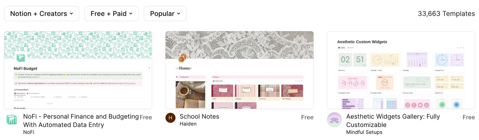
- When it works: the product is general-purpose and the first screen has no obvious right answer. Two or three starter templates for the jobs people actually arrive with beat any explanation of what the product can do.
- When it annoys: when the gallery is the onboarding. A wall of two thousand templates is a blank page with extra steps, and “browse templates” as the only call to action pushes the decision back onto someone who has not used the product yet. It also goes wrong when the template is a demo rather than a start: people delete the sample content before they can use it.
- Build the same thing: the templates themselves are product work — no onboarding tool creates them. What a tool can do is put a tooltip on the empty state pointing at the two templates you want picked, or a modal on first visit with three named starting points that deep-link into the product. Measure: share of new accounts that create something from a template in the first session, and how many of those still exist a week later.
2. Canva — ask what they are making, not what they want to learn
Canva’s opening move is a question with real answers: what are you making? Picking “Instagram post” or “presentation” hands you a canvas at the right size with something already on it. The question is doing two jobs at once — it segments the user, and it removes the first decision that has nothing to do with the work.
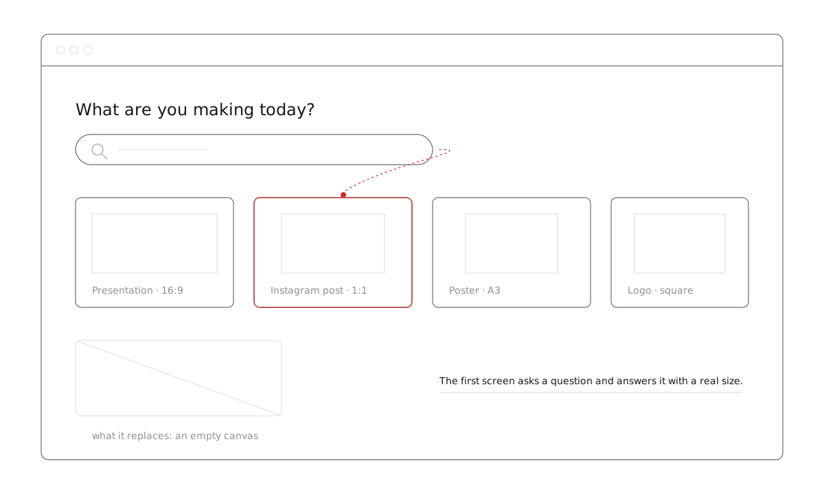
- When it works: the product serves several clearly different jobs and the right first screen depends on which one. One question, answered in a click, is cheaper than a tour explaining all of them.
- When it annoys: when the answer changes nothing. A three-question “onboarding survey” whose answers never show up again is a toll booth, and people learn to click whatever is first. It is also wrong when the options are internal vocabulary — nobody arrives wanting to make a “document object”.
- Build the same thing: a modal on first visit with three to five options, each a link into the product; pass the choice back with
Clew.identify()so later tooltips and checklists can differ by segment. Measure: how many people answer rather than dismiss, and whether the people who answered reach the first real action more often than those who did not.
3. Linear — teach speed where people work
Linear is built around the keyboard but doesn’t make you memorize shortcuts up front. They live in a searchable help panel inside the app, which the company announced in its changelog. You find a shortcut when you need it.
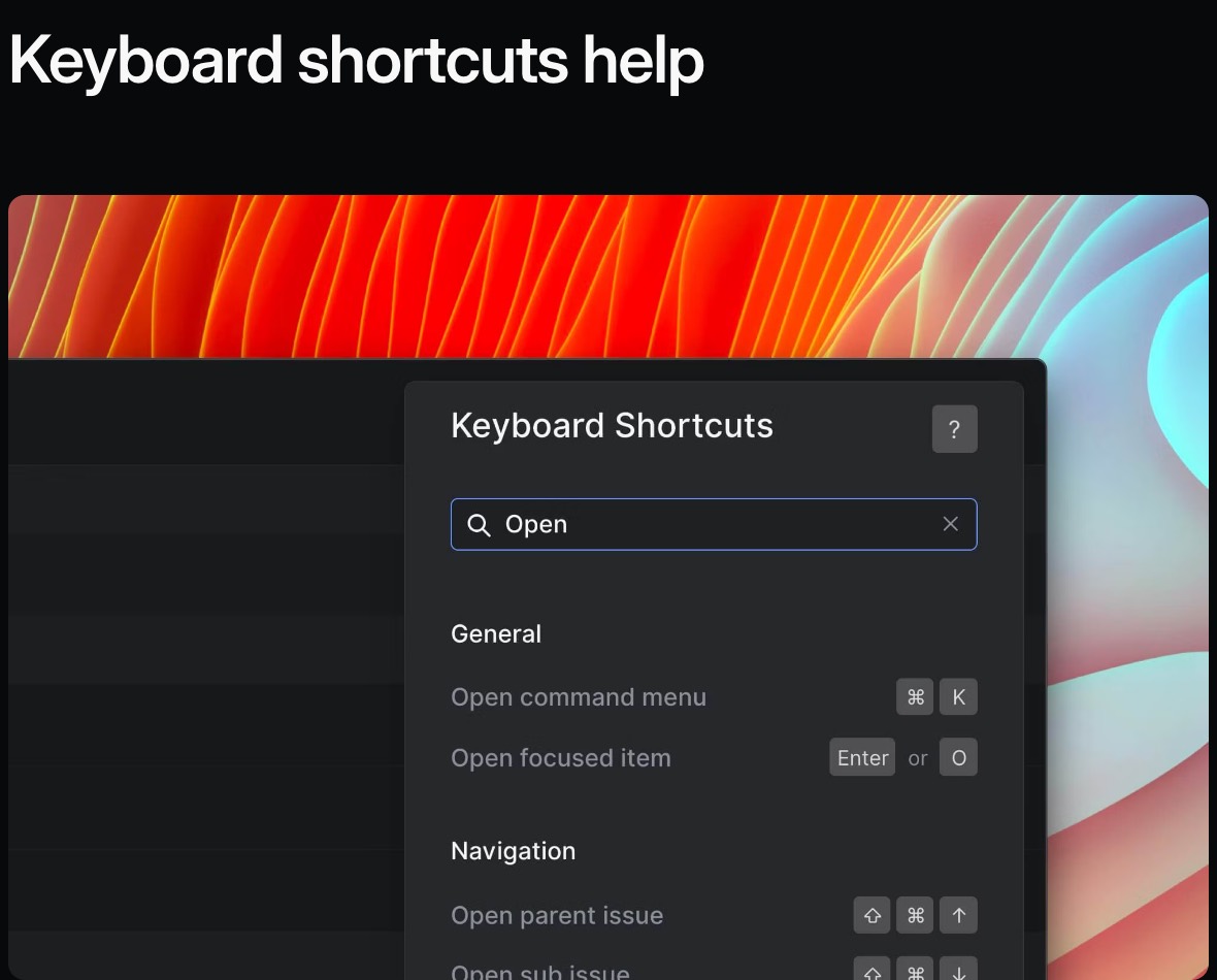
- When it works: the product has real depth and the power features only make sense once someone has done the slow version a few times. Revealing them at that moment — next to the button they just clicked — lands.
- When it annoys: when it is front-loaded. Thirty shortcuts on day one is a reference card nobody reads. The other failure is the hint that never goes away: a tooltip that reappears on every visit after the user has learned the shortcut reads as nagging.
- Build the same thing: a tooltip on hover or on the third visit, anchored to the control, with frequency set to once per visitor so it retires itself. Measure: how many people who saw the hint used the faster path afterwards — that one needs an event in your own analytics, not the tour tool’s.
4. Slack — a bot that walks you through
In Slack a built-in bot handles the first steps: a direct message walks you through the basics, such as sending a first message and finding channels. That step only exists inside a workspace, so below is our schematic of the pattern rather than a screenshot.
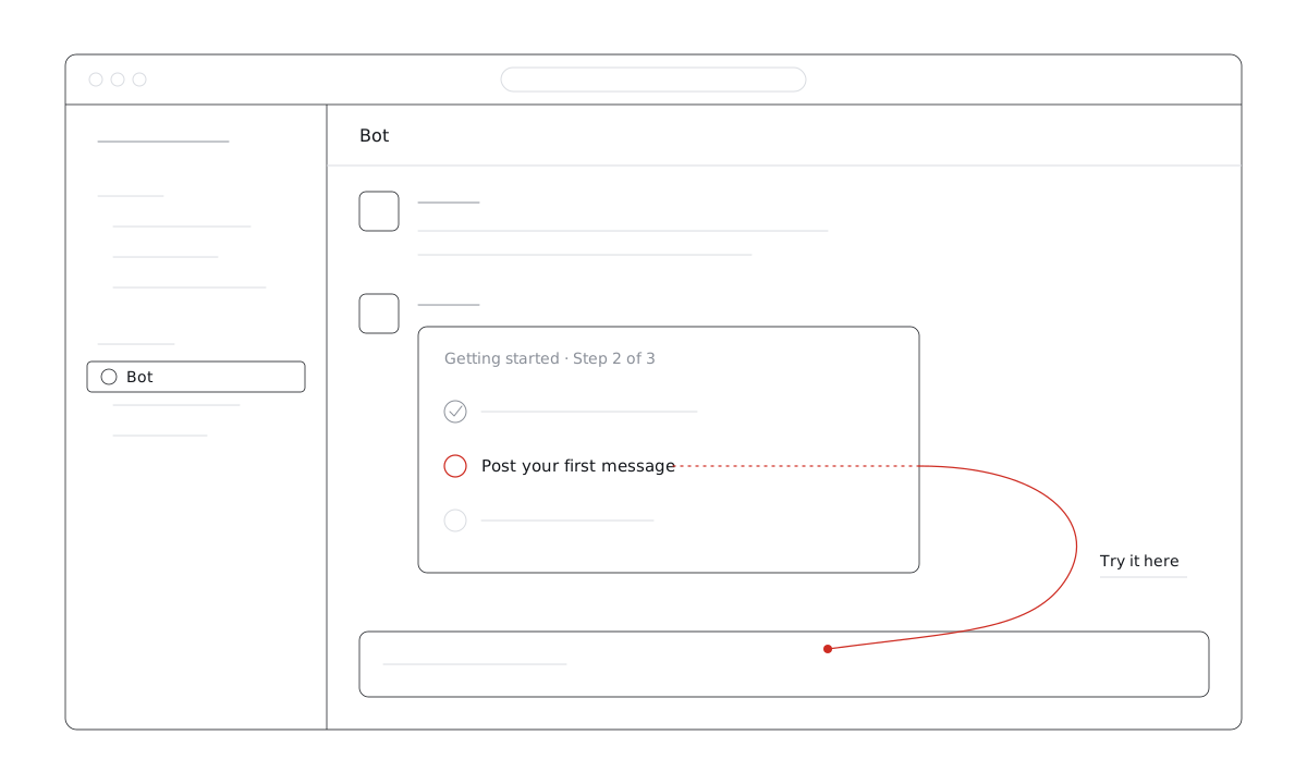
- When it works: the product is a place people already sit in, so onboarding delivered as a message arrives in the same channel as everything else. It also survives interruption well — the thread is still there tomorrow.
- When it annoys: the moment it posts more than a few times. A bot that greets, reminds, congratulates and re-reminds gets muted, and muting it kills every future message too. It also annoys when it is not skippable, or when it talks to people who were added to an existing workspace and already know the product.
- Build the same thing without a bot: an onboarding checklist in the corner, three to five items, whose items tick themselves when the user visits a page or clicks something. It persists between visits the way a thread does, without the notification cost. Measure: per-item completion — the item everyone stalls on is your real onboarding problem.
5. Stripe — a sandbox with real mechanics, and a checklist out of it
Stripe lets you do the whole job before you are allowed to do it for real: a test mode with sample data and test keys, where payments behave like payments and nothing moves money. Alongside it sits the list of what is still missing before the account can go live. The pattern is two halves — a safe place to learn, and an explicit path out of it.
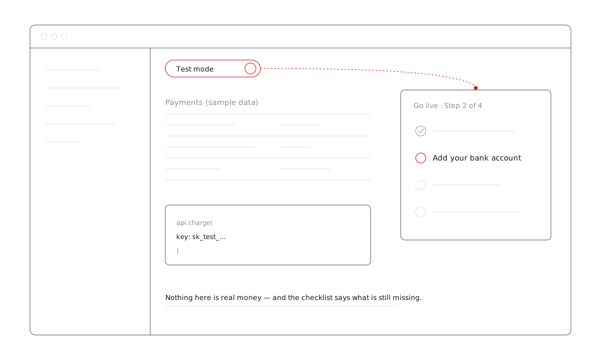
- When it works: the real action is irreversible, expensive or gated by paperwork — payments, sending email to customers, deploying. Letting people rehearse removes the fear, and the checklist keeps the sandbox from becoming a permanent home.
- When it annoys: when the two modes drift. A sandbox that behaves differently from production teaches the wrong thing and costs trust the first time something fails live. It also annoys when the activation checklist is really a compliance form — five items that are all “upload a document” is not onboarding, and dressing it up as progress is worse than being honest about it.
- Build the same thing: the sandbox is product work; the path out of it is not. An onboarding checklist with three to five items that tick on real product events —
Clew.complete('bank-added')where the event happens — plus a tooltip on the mode switch the first time someone opens the dashboard. Measure: how many accounts leave the sandbox, and how long it takes them.
6. GitHub — the empty state is the instruction
A freshly created repository has nothing in it, and the page you land on is not an explanation of what a repository is. It is the exact commands to push one, with a copy button. The empty state does the teaching, and it does it in the form the user needs next: something to paste.
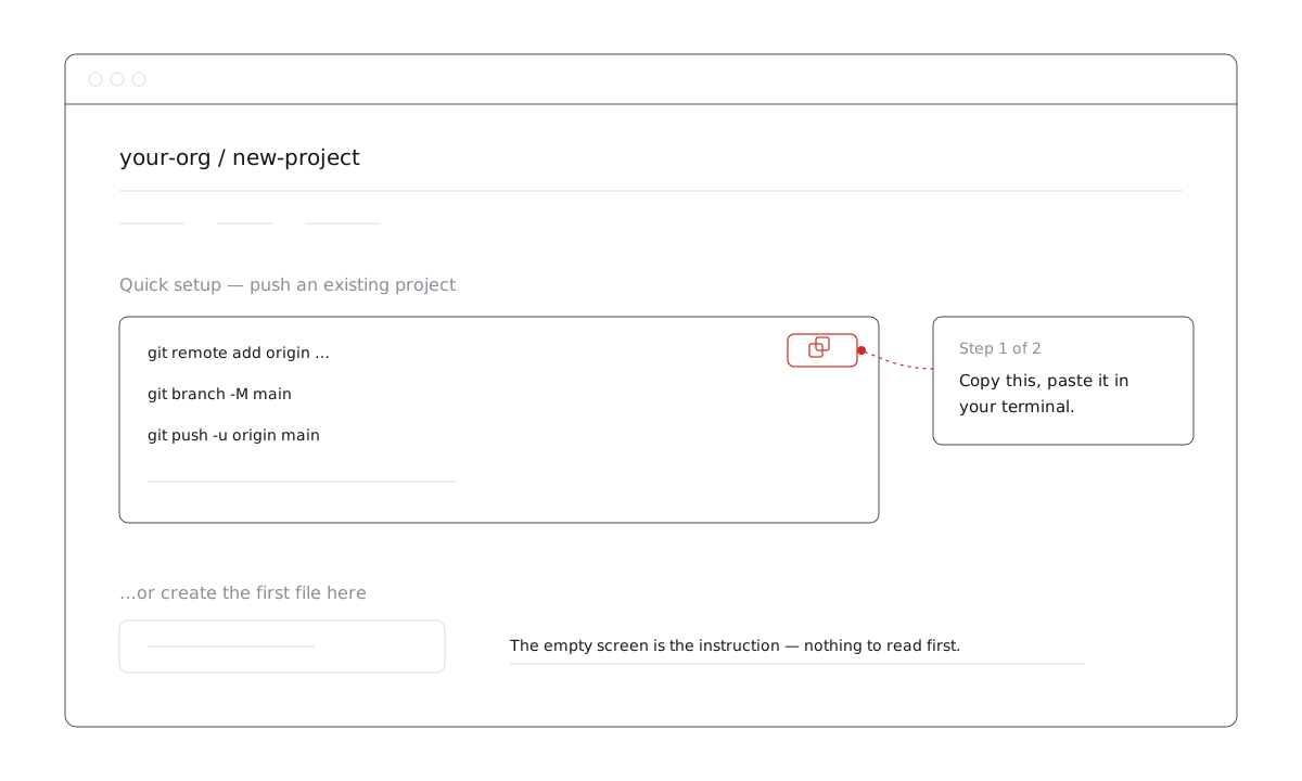
- When it works: there is exactly one sensible next action and it can be handed over literally — a command, a snippet, a script tag. Every word you replace with something copyable is a word nobody has to read.
- When it annoys: when the snippet is not actually runnable — placeholders the user has to fill in without being told what from, or a block that assumes tools they have not installed. And when the empty state offers six equally weighted routes: an empty screen with a menu on it is still an empty screen.
- Build the same thing: a tooltip anchored to the copy button on first visit to the empty screen, page rule set to that URL, frequency once per visitor. If the setup has more than one step, make it a two-step tour rather than one long paragraph. Measure: how many people who land on the empty state do the action, and how many come back to it a second time — repeat visits mean the snippet did not work.
7. Duolingo — value before sign-up
Duolingo doesn’t open with an email-and-password form. The first screen of its registration page asks what you want to learn, and you pick a course and a goal before you create an account.
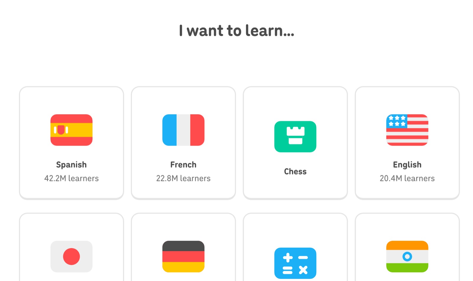
- When it works: the product can deliver something worth having in under a minute, so the account becomes the way to keep it rather than the price of seeing it.
- When it annoys: when the form still comes, just later — and now with sunk effort attached. People notice being walked up a ramp into the same gate, and a long form after a warm start feels worse than one at the door. It also goes wrong when the pre-sign-up choice is thrown away and the product asks the same questions again afterwards.
- Build the same thing: this one is mostly how your sign-up is built, not a tour-tool job. What a tool adds is the marketing-page half: a tooltip or modal on the pricing or landing page that starts the same choice, with the answer carried into the app. Measure: completion of the first meaningful action, not sign-ups — this pattern trades a cheaper sign-up for a warmer one.
8. Miro — templates against the infinite canvas
Miro has Notion’s problem at a larger scale: an endless board. Templates lower the barrier — the public gallery is organized by job (research, strategy, diagramming, brainstorming, agile) with search on top.
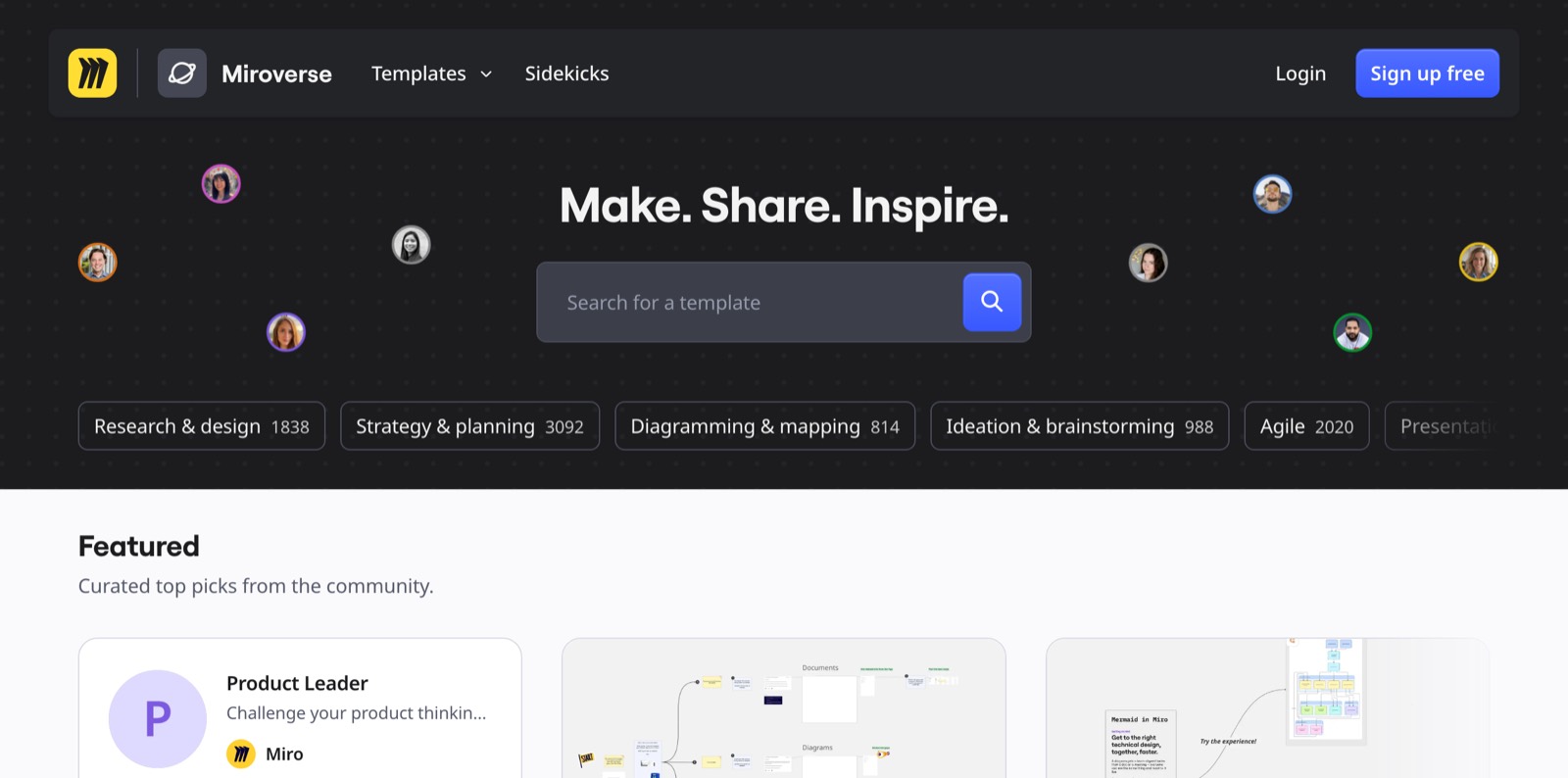
- When it works: when the categories are named after the user’s job rather than your object model. “Retro” and “journey map” are things people arrive wanting; “board” is not.
- When it annoys: when the gallery lives on the marketing site and the product’s own first screen is still empty — the person who signed up never sees it. And when the template opens a canvas covered in instructions the user now has to delete before doing any work.
- Build the same thing: a tooltip on the empty board pointing at the template button, or a checklist whose first item is “open a template” and ticks itself when the right page is reached. Measure: share of new boards that start from a template versus blank, and which templates survive the first week.
9. Figma — learn in a real file
Figma teaches with files you can open and poke at rather than videos about tools: its community has tutorial files and “playgrounds” for practicing specific features such as auto layout and variants.
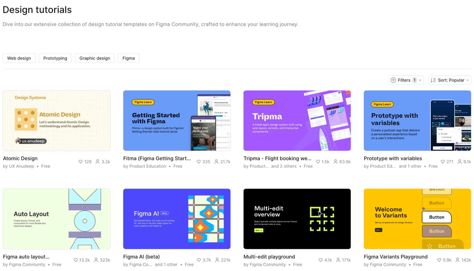
- When it works: the skill is motor rather than conceptual — something you learn by doing it badly a few times. A file you can break is worth more than a video of someone not breaking it.
- When it annoys: when the sandbox is unguided. Sample data with no hints in it is a blank screen with content on it, and people close it without learning the thing it was built to teach. It also annoys when the practice file is a detour: sent off to a tutorial, the user loses the thread of the work they came to do.
- Build the same thing: a short tour over the sample data — three to five steps, page rule scoped to the demo file or demo project, so it never fires on real work. Measure: completion of the tour, drop-off per step, and whether people who finished it go on to create something of their own.
10. Banking portals — a hint next to the hard action
Financial portals are full of rare, high-stakes operations: limits, transfers, statements. Targeted hints next to a specific control, walking through it step by step, work well here. Banking portals sit behind a login, so we show a generic schematic rather than any particular bank.
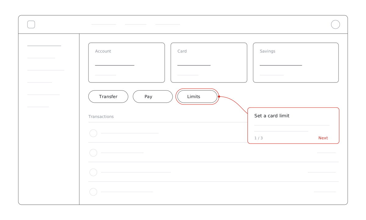
- When it works: the interface is dense, the action is rare, and the cost of getting it wrong is real. A hint at the control beats a tour through every section, because the user is already on the screen that matters.
- When it annoys: when it fires on people who do this every day. A hint on a rare action shown to a power user is noise, and in a portal people log into weekly that noise compounds fast. The quieter failure is worse: after a front-end release the hint’s element is gone, the hint silently disappears, and nobody finds out until support does.
- Build the same thing: a tooltip or a two-to-three-step tour on the control, with an audience rule excluding people who have already completed the action, and frequency once per visitor. Watch the broken-step report — in a product that ships weekly, that is the part that actually needs maintaining. Measure: completion of the action after the hint, and ticket volume on that topic.
What an onboarding tool can build here, and what it can’t
We make such a tool, so here is the honest split: which of these ten patterns you can build without engineering, and which stay the product’s own work.
- Product work, not tool work: the templates themselves (Notion, Miro, Canva), the sandbox (Stripe, Figma), the sign-up flow (Duolingo), the generated commands (GitHub). No onboarding tool creates any of these.
- Tool work: pointing at them. A tooltip on the empty state, a modal that asks the first question, a checklist that names what is still missing, a short tour over sample data, a hint on a rare control — all of that is built by clicking elements on your live page and edited without a release.
- The part people forget: retiring a hint once it has done its job, and noticing when it breaks. Both are targeting and monitoring problems, which is most of what a tool is actually for.
- Where Clew stops: no chat bot (a corner checklist is the closest thing), no native mobile, no surveys yet. Tours and tooltips are on the Free plan; modals, audience rules and checklists start on Pro.